in the ever-evolving world of design, the allure of vintage aesthetics continues to captivate our senses, evoking nostalgia and charm that transport us to a simpler time. Whether you’re redecorating a cozy living room, crafting the perfect wedding invitation, or curating a unique online presence, the right color palette can breathe life into your vintage vision. This article delves into the best color palettes that embody that timeless feel—capturing the essence of bygone eras while seamlessly integrating into modern spaces. Join us as we explore a spectrum of hues that echo whispers of history, inviting warmth and character into your projects. From muted pastels to rich jewel tones,discover how to choose colors that will not only enhance your designs but also resonate with the beauty of the past.
Exploring Timeless Hues That Capture Nostalgia
When it comes to evoking a sense of nostalgia, color plays a pivotal role. The right palette can transport us back in time, reminding us of cherished memories and bygone eras. Consider vibrant yet dusty rose pinks and Moss greens, which together create a sense of warmth and comfort. Additionally, soft mustard yellows and muted peacock blues can serve as delightful accents, reminiscent of vintage textiles and classic home decor. Here’s a brief overview of some classic color combinations that capture the essence of nostalgia:
| color | Hex Code | Feeling |
|---|---|---|
| Rose Pink | #D05F7E | Warmth, Romance |
| Moss Green | #5C8A4B | Earthy, Tranquil |
| mustard Yellow | #E2CE6E | Cheerful, Energetic |
| Peacock Blue | #3B8E94 | Calm, Sophisticated |
Furthermore, layering these hues can create depth and harmony in any space. Utilizing shades like muted terracotta or creamy beige can ground an environment,bringing a soft,vintage feel while balancing bolder colors. Don’t hesitate to incorporate patterns that echo the past, such as damasks or florals in those timeless hues. The combination of color and pattern will not only enhance the vintage appeal but also allow personal stories and emotions to shine through.
The Impact of Texture and material on Vintage Color Choices
The confluence of texture and material play a pivotal role in shaping the color palette of vintage-inspired designs.when selecting hues, it’s crucial to consider how different surfaces interact with light and evoke emotions.For instance, the shimmer of silk can transform a simple color, enhancing its vibrancy, while the matte finish of linen tends to soften shades, creating a more subdued, nostalgic feel. Observing the way these textures harmonize with surrounding materials enables a more intentional approach to color selection.
Historically, specific materials have been associated with distinct palettes, capturing the spirit of the times. A careful examination of past eras reveals a pattern where the following materials influenced color choices:
- Velvet: Deep jewel tones like emerald and ruby
- wood: Earthy greens and browns
- Ceramics: Soft pastels and muted hues
- Metal: Aged gold and bronze shades
to illustrate these relationships, consider the following table that shows how specific materials align with vintage color trends:
| Material | Color Palette |
|---|---|
| Silk | Rich burgundies and golds |
| Linen | Soft creams and gentle blues |
| Brass | Warm amber and deep forest greens |
| Glass | Cool aqua and muted pinks |
Combining Muted Shades for a Cohesive Aesthetic
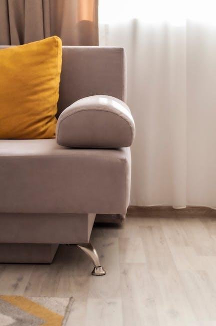
Crafting a vintage aesthetic frequently enough hinges on the delicate balance of muted colors that evoke nostalgia and warmth. By combining shades like dusty mauve, sage green, and soft taupe, you create a palette that feels both inviting and timeless. These colors work harmoniously together, softening contrasting elements while adding depth to your design.Consider pairing these tones with natural materials such as wood or linen to enhance the vintage feel, allowing your space to resonate with a sense of history and comfort.
To further enrich your palette, don’t hesitate to incorporate subtle accents of faded mustard or soft blush. these accents can bring life to the muted base colors without overwhelming the serene composition. A well-placed accessory, like a vintage poster or an antique piece of furniture, can serve as an anchor point in your color scheme, tying together various shades and creating a cohesive look. Here’s a simple table illustrating how to mix and match these shades effectively:
| Base Color | Accent Color | Complementary Elements |
|---|---|---|
| Dusty Mauve | Faded Mustard | Wicker or Rattan furniture |
| Sage green | Soft Blush | Vintage Glassware |
| Soft Taupe | Light Grey | Antique Wood Accents |
Practical Tips for Implementing Vintage Color Palettes in Modern Spaces
Integrating vintage color palettes into modern spaces can be an invigorating journey, blending nostalgia with contemporary design.One effective approach is to create a feature wall using muted pastels or deep jewel tones that exude vintage charm. Consider colors like sage green, dusty rose, or burnt ochre as the base, and complement them with vintage-inspired accessories. Incorporating soft fabrics in these hues—such as cushions or throws—can further enhance the look. Additionally, vintage patterns in textiles, such as florals or geometrics, can help tie the space together while providing a striking contrast against sleek modern furniture.
another practical tip is to use color as a storytelling element. You can achieve this through layering textures and tones that evoke a certain time period. As a notable example, softer, faded colors can give a nod to the 70s while bold primary shades might reflect a mid-century aesthetic. Pair colors with vintage pieces—think of antique lamps,retro artwork,and aged wooden furniture—to create an authentic feel. To assist in visualization, here’s a simple table outlining some suggested palettes and their corresponding vintage themes:
| Palette | colors Included | Vintage Era |
|---|---|---|
| Earthy Naturals | Terracotta, Olive, Cream | 1970s |
| Soft Pastels | Mint, Lavender, Peach | 1950s |
| Bold & Bright | Primary Red, Mustard, Teal | Mid-Century |
Key Takeaways
As we’ve explored the enchanting world of vintage color palettes, it’s clear that the hues we choose can transform a space or a project into a captivating time capsule, evoking nostalgia and charm. Whether you’re drawn to the soft pastels of the 1950s or the deep, rich tones of the Victorian era, each palette offers a unique way to celebrate the artistry of the past while infusing modern aesthetics.
Remember, the beauty of color lies not only in its shades but also in the emotions it evokes and the stories it tells. So as you embark on your vintage-inspired journey, let these palettes guide you in creating a harmonious blend of old and new. Embrace the journey of discovery, experiment with different combinations, and most importantly, make it your own. With the right colors at your fingertips,the allure of yesteryear can shine brightly in your contemporary world. Happy coloring!


