


In the world of interior design, colour is more than just a shade; it’s a powerful tool that can shape the atmosphere of a space, evoke emotions, and reflect personal style. While trends come and go, there exists a palette of timeless paint colors that transcends the fleeting whims of fashion, offering a serene backdrop for everyday life. In this article, we will explore versatile shades that have stood the test of time, enriching every room with thier enduring charm and flexibility. From tranquil blues that invite calm, to warm neutrals that create a cozy ambiance, discover the hues that can transform your home into a harmonious sanctuary. Whether you are refreshing a single room or embarking on a full home makeover, these classic colors promise to inspire and elevate, ensuring your spaces remain stylish and welcoming for years to come.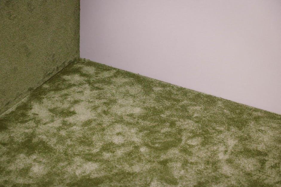
Captivating Neutrals: The Foundation of Timeless spaces
When it comes to designing serene spaces, neutrals serve as the perfect backdrop, allowing other elements within the room to shine. These versatile shades create an inviting atmosphere that appeals to diverse tastes and preferences.Whether you’re aiming for modern minimalism or classic elegance, a carefully chosen neutral palette can transform any room into a sanctuary. Think of hues like soft greys, warm beiges, and creamy whites, each offering its own unique character while remaining effortlessly sophisticated.
Incorporating neutrals doesn’t mean sacrificing personality; rather, it allows you to layer textures and complementary colors for depth. Here are some ways to use neutral tones to enhance your space:
- Accent Walls: Use a darker neutral on one wall to create a focal point.
- Textured Fabrics: Pair neutral walls with textured linens or rugs to add warmth.
- Natural Elements: Incorporate wood or stone accents to bring organic beauty into the mix.
discovering the right balance of neutrals can be an exciting exploration. Below is a simple table summarizing ideal neutral colors and their recommended rooms:
| Color | Recommended Room |
|---|---|
| Soft Taupe | Living Room |
| Cool Stone | Bathroom |
| Pale Sage | Bedroom |
| Ivory White | kitchen |
Bold Accents: infusing Personality into Classic Palettes
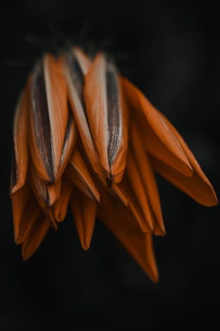
In the realm of interior design, classic color palettes ofen serve as a timeless backdrop, but they shouldn’t be the sole focus. By incorporating bold accents, you can introduce vibrancy, making your spaces feel both dynamic and inviting. As a notable example, pairing a soothing cream or soft gray with a striking shade of emerald green or a pop of sunny yellow can create a captivating contrast, giving life to or else serene settings. Such bold hues can be introduced through furniture, artwork, or even smaller decor pieces like cushions or vases, allowing you to tweak the visual narrative of your room effortlessly.
Consider using complementary colors to elevate the classic tones further. here are some ideas to get your creativity flowing:
- Combine muted blues with a rich burnt orange for a warm, inviting atmosphere.
- Use a soft beige and add accents of deep burgundy for a touch of elegance.
- Pair off-white with vivid teal to infuse energy into your space without overwhelming it.
To give a clearer visual representation, here’s a simple table showcasing potential classic and bold accent combinations:
| Classic Color | Bold Accent |
|---|---|
| Ivory | Coral |
| Soft Taupe | Electric Blue |
| Navy | Bright Chartreuse |
Experiment with these combinations to find a balance that resonates with your personal style, turning each room into a statement of individuality while still honoring the timeless appeal of classic colors.
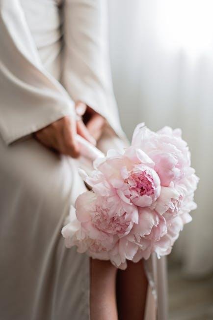
Soft Pastels: Creating Tranquility in Every Room
Soft pastels have an innate ability to evoke serenity and calm, making them an ideal choice for any room where relaxation is paramount. Their gentle hues, ranging from powdery blues to whispering pinks, infuse a space with a sense of tranquility that can transform even the most chaotic of environments. These shades are incredibly versatile, allowing for a seamless mix with different styles, from rustic charm to modern minimalism. When utilized in living rooms, bedrooms, or even home offices, soft pastels can create a welcoming sanctuary that encourages peace and reflection.
In decorating with soft pastels, it’s essential to strike a balance that enhances your space rather than overwhelms it. Consider combining pastels with neutral tones to ground the room, or add accents in deeper shades for a touch of contrast. Here are some creative ideas for integrating soft pastels into your decor:
- Pale mint Green: Perfect for refreshing and energizing spaces.
- Soft Lilac: Great for adding a whimsical, romantic vibe.
- Baby Blue: Ideal for a calming influence in bedrooms or bathrooms.
- Blush pink: Brings warmth and comfort to living areas.
| Color | Room Advice | Feel |
|---|---|---|
| Pale Peach | Dining Room | Welcoming |
| Sky Blue | Nursery | Soothing |
| Mint cream | Kitchen | Refreshing |
| Lavender | Home Office | Calming |
Rich Dark Tones: Adding depth and Elegance to Your Home
When it comes to enhancing the aesthetic of your living spaces, choosing rich dark tones can make all the difference.These hues not only evoke a sense of sophistication but also create an inviting atmosphere.Bold colors like deep navy, forest green, or charcoal gray can serve as the perfect backdrop for lighter furnishings, allowing them to pop while simultaneously grounding the room. To achieve a harmonious balance, consider incorporating these elements:
- Contrasting textiles, such as lighter curtains or plush throw pillows, to soften the overall look.
- Warm metallic accents, like gold or brass, can lend a touch of glamour and reflect light in a subtle manner.
- Natural wood finishes that complement dark walls,enriching the space with texture and warmth.
Along with aesthetic appeal, darker colors can also enhance the feeling of intimacy in larger rooms. Using them strategically can define areas within an open floor plan, creating cozy nooks that invite conversation and relaxation. To make the most of these tones, it’s essential to focus on lighting and color balance throughout your space. Here’s a quick guide to some popular dark colors and their corresponding room uses:
| Color | Best Room Use |
|---|---|
| deep Navy | Living Room |
| charcoal Gray | Office |
| Forest Green | Bedroom |
| Rich burgundy | Dining Room |
Wrapping Up
As we close the palette on our exploration of timeless paint colors, it becomes clear that the right hue can do more than just coat the walls; it can transform a space, evoke emotions, and tell a story. Whether you opt for soothing neutrals,bold statement shades,or earthy tones that connect you to nature,these color choices are not just trends—they’re enduring classics that can adapt with your evolving style.
Remember, the beauty of paint lies in its versatility. Each room offers a unique opportunity to express your personality, embrace your creativity, and create an atmosphere that welcomes and inspires. As you embark on your painting journey, let these timeless colors guide you in making choices that resonate with both your vision and the character of your home.
So, gather your brushes, choose your palette, and bring your spaces to life—as with the right color, every room can become a masterpiece waiting to unfold. Happy painting!

